Cover Themes I Love:
1. Books - Is there a book on that cover? I don't even need to know what it's about because I can pretty much guarantee I'll be reading it. Luckily, I've found that most books with books on the cover tend to be pretty good reads!
2. Spooky looking covers - I love a misty ambiguous cover where I'm not quite sure what's going on but it looks seriously spooky. Sometimes it's an old house just visible to the side. Sometimes it's a figure walking away from the camera and disappearing into the mist. Whatever it is I'm usually on board.
3. Profiles - It's typically a woman but they're always looking off at something. Either out to the sea, or slightly up just outside of the cover. They're normally serious and look like they've got a lot on their mind. I always want to know more!
4. Someplace I Want to Be - If the cover features a place I'd like to be at the moment I'm definitely going to take a second look. It could be somewhere exotic and adventurous, it could be the beach, it could be a comfy chair in front of the fire. Regardless, if the setting looks appealing I'm going to be picking it up.
5. Pretty Dresses - I know a lot of people have gotten tired of this particular theme but it still gets me every time. I love a pretty dress (as long as it's not part of a clinch cover) and I'll end up picking up the book just because of that!
Cover Themes I Don't Love:
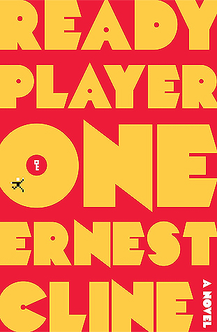
1. Garish Colors - If you need to wear sunglasses to look at a cover I'm probably going to just keep walking. Especially if there's nothing else of visual interest. (I did really enjoy Ready Player One but am not a fan of the cover)
2. Cartoon-y Covers - This seems to be especially common with cozy mysteries and I've gotten pretty good at just ignoring them but when faced with a choice between a book with a more standard picture cover or a cartoon-y cover I'll pick the picture cover every time.
3. Clinch Covers - I love romance but I can't stand a clinch cover - especially
if the couple's clothes are falling off. This is one of the reasons I'm grateful for my Kindle! I think I got super self conscious about them when I had small kids around because explaining to a 5 year old why the guy on the cover is shirtless and the woman's dress is coming off is just not a good time.
Apparently there aren't many cover themes that I don't like because that's all I can think of! What cover themes do you love or don't love?


I love pretty dresses, too! I know some people don't care for it, but I see a girl with a pretty dress on the cover and I am in!
ReplyDeleteClinch covers aren't my favorite either.I can't say it will make me not read a book, because I read so many romances, it's impossible to not come across them. But they aren't my favorite.
I think the covers influence us picking up a book, a visual appeal. I like settings of Ireland or England and yet am not a fan of other faraway places such as China or the Middle East. Most of what you wrote holds true for me - don't like cartoon covers at all.
ReplyDeleteI am a huge fan of pretty dresses on covers, too! I know a lot of people bash them, but I can't help it! Pretty dresses are just so alluring.
ReplyDeleteMy TTT.
Ooh, you nailed some of my turnons and turnsoffs for covers too. Also if the cover looks like it might have anything to do with Amish fiction, I won't even go near it.
ReplyDeleteLove that you choose covers you don't like too. I love profiles on covers but I hate covers with straight on shots of real people on them! I'd rather picture the character myself.
ReplyDeleteBooks on the cover almost always work for me too. Love that cover on The Bookshop on the Corner, and spooky looking covers are great too. I do get swayed by covers that show places I'd like to go too, especially if it's in Europe.
ReplyDeleteI like that Fatality by Firelight one too. Why do coziness and murder go so well together?? lol
Ahh, I love cartoony covers that is one of my favorite types on cozies. :)
ReplyDeleteIt is hard to pass by a book that has a book on the cover and I do love pretty dresses. The kindle is great for hiding covers from others. I used to really think about what book I was bringing somewhere based on the cover. Great list!
ReplyDeleteI was fooled with an alternate cover for and ebook I got for free last week. I went to Goodreads to add it and the paperback cover was a barechested guy and a woman wuth her top falling down. XD
ReplyDeleteBooks get me, too! I am self-conscious about "clinch" covers as you call them, and I love that I can read on my Kindle and nobody knows!
ReplyDeleteOh yes. Bookish ones get me, too :)
ReplyDeleteI love this post. I will say that as basic as the cover for Ready Player One is, it's very recognizable. I know it from even just seeing part of it. So as boring as it is, it gets attention.
ReplyDeleteI love books with books, bookstores or libraries on the cover. PS I love your blog title!
Books or bookish themes on a cover get me every time!! :) My TTT
ReplyDeleteI feel you on the clinch covers.
ReplyDeleteLauren @ Always Me
I'm not a romance fan to begin with but those clinch covers may well be part of the reason. I'm with you, I really dislike those!
ReplyDelete